티스토리에 호버 버튼 적용을 해보았습니다. 호버 버튼을 만들기 위한 CCS Code와 버튼 html code를 만들어서 적용한 코드와 내용들 테스트된 버튼까지 정리하였사오니 참조하세요.
Hoverable Buttons CSS Code
아래 코드를 티스토리 > 관리 > 좌측메뉴 꾸미기 > 스킨편집 > html 편지 > 탭메뉴 HTML CSS 파일업로드 중에서 CCS 선택 합니다. 그러면 CSS 에디터 창 코드들이 보이실껀데 맨 아래로 스크롤 다운 하시고 맨 아래 아래의 코드를 Copy & Paste 해넣으시고 적용 버튼을 클릭하면 적용됩니다.
Hoverable Buttons HTML Code
아래 코드를 티스토리 블로그 포스팅 글 작성할때 우측 상단에 기본모드, 마크다운, HTML 모드중에서 HTML 편집 모드에 들어가서 Copy & Paste하시고 필요하신대로 수정해서 사용하시면됩니다.
<h2>Hoverable Buttons</h2>
<p>Use the :hover selector to change the style of the button when you move the mouse over it.</p>
<p><strong>Tip:</strong> Use the transition-duration property to determine the speed of the "hover" effect:</p>
<button class="button button1">Green</button>
<button class="button button2">Blue</button>
<button class="button button3">Red</button>
<button class="button button4">Gray</button>
<button class="button button5">Black</button>
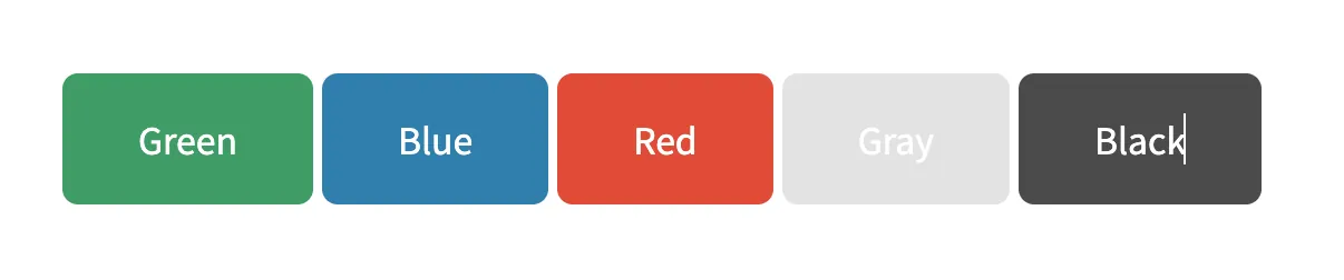
Hoverable Buttons 적용 결과
위 버튼 html 코드를 적용하시면 아래와 같이 적용된 버튼이 나옵니다.
버튼에 사이트 링크 결합 예제 : 네이버
아래 사이트를 참조해서 위 정보를 정리하였습니다.
https://www.w3schools.com/css/tryit.asp?filename=trycss_buttons_hover
W3Schools online HTML editor
The W3Schools online code editor allows you to edit code and view the result in your browser
www.w3schools.com
<!DOCTYPE html>
<html>
<head>
<style>
.button {
background-color: #04AA6D; /* Green */
border: none;
color: white;
padding: 16px 32px;
text-align: center;
text-decoration: none;
display: inline-block;
font-size: 16px;
margin: 4px 2px;
transition-duration: 0.4s;
cursor: pointer;
}
.button1 {
background-color: white;
color: black;
border: 2px solid #04AA6D;
}
.button1:hover {
background-color: #04AA6D;
color: white;
}
.button2 {
background-color: white;
color: black;
border: 2px solid #008CBA;
}
.button2:hover {
background-color: #008CBA;
color: white;
}
.button3 {
background-color: white;
color: black;
border: 2px solid #f44336;
}
.button3:hover {
background-color: #f44336;
color: white;
}
.button4 {
background-color: white;
color: black;
border: 2px solid #e7e7e7;
}
.button4:hover {background-color: #e7e7e7;}
.button5 {
background-color: white;
color: black;
border: 2px solid #555555;
}
.button5:hover {
background-color: #555555;
color: white;
}
</style>
</head>
<body>
<h2>Hoverable Buttons</h2>
<p>Use the :hover selector to change the style of the button when you move the mouse over it.</p>
<p><strong>Tip:</strong> Use the transition-duration property to determine the speed of the "hover" effect:</p>
<button class="button button1">Green</button>
<button class="button button2">Blue</button>
<button class="button button3">Red</button>
<button class="button button4">Gray</button>
<button class="button button5">Black</button>
</body>
</html>
'프로그래머' 카테고리의 다른 글
| 구글 검색 삭제 요청 블로그 삭제페이지 및 404에러 페이지 검색 삭제요청하기 (0) | 2024.01.17 |
|---|---|
| 애드센스 및 구글서치콘솔에서 검색삭제요청 블로그 삭제페이지, 404 에러페이지 색인생성 정리방법 (0) | 2024.01.17 |
| Blogger 구글 불로그 스팟 새 블로그 만들기 (0) | 2024.01.10 |
| [해결방법]마이크로소프트 엣지 검색 누락 블로그글 검색이 안되요 | 빙(Bing) 웹마스터도구에 블로그 글 웹페이지 수집 요청 방법 (0) | 2024.01.09 |
| [해결방법]구글 검색 누락 블로그글 검색이 안되요 | 구글 서치 콘솔 블로그 글 웹페이지 수집 요청 방법 (0) | 2024.01.08 |


